Okay, I literally tried to think of the most bearish headline possible. To be clear, though, I’m actually still bullish on the long-term structure of this market. I’ve learned that when my Market Trend Model is bullish on the long-term and medium-term time frames, the primary trend is still positive. And that’s not a judgment call; that’s a fact based on the trend as defined by the weekly moving averages.
But just before the holidays, I found myself less and less able to ignore the extremely euphoric breadth readings, which tend to coincide with meaningful market tops. Not necessarily “the world is ending” type of tops, but definitely the “I probably want to wait to see how this plays out” sort of tops.
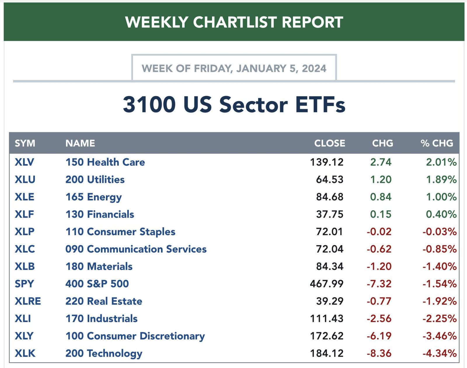
2024 has thus far started with a whimper for stocks, with growth sectors giving back some of the gains from December.
Should we be surprised by this initial downswing in the new year? And what warning signs should we be preparing for to anticipate a deeper and more sustained correction?
Seasonal Trends Suggest Weakness in Q1
The reality is that this initial weakness in January is actually quite common in an election year. Jeff Hirsch, editor of the Stock Trader’s Almanac, addressed this seasonal pattern recently on my show. And the seasonal charts on StockCharts tell the same concerning story.
If you look at the last five election years, you’ll find that the first quarter is actually the weakest three-month period. The S&P 500 is down an average of about 1% in each of the first three months of the year, and each month has finished lower in two out of the last five observations.
Your eyes may also be drawn to the month of October, which is almost always a down month with an average return of -4.3%! But we’ll get to that later this year. Going back to the current market, we find an important sell signal that was registered this week.
Key Short-Term Breadth Indicator Turned Bearish
The McClellan Oscillator looks at the changes in advance-decline data to create a momentum indicator for breadth, sort of an RSI for the market breadth. And this week’s price deterioration pushed this indicator below the zero level.
I’ve shaded the chart green when the McClellan Oscillator is above zero, and red when the indicator has moved below zero. Note the general trend in the S&P 500 index (bottom panel) during the green- and red-shaded areas, and you’ll see why this recent sell signal leaves me thinking that further downside may be in store.
So now we have a weak seasonal pattern based on the average election year, as well as the confirmation of breadth conditions beginning to turn lower. So what chart could help us confirm that this is not just a brief one-week pullback but something more potentially sinister?
Volatility May Bring Confirmation
When markets move higher, you tend to see lower volatility. This is because investors usually don’t completely freak out and then buy aggressively; they tend to accumulate positions over time. But when things turn lower, panic takes control and we hit the sell button aggressively to try and assuage our fears. That’s why volatility spikes in a down market, and that’s why the VIX may be a good chart to follow in January.
This week’s selloff saw the VIX go from just above 12 to just above 14 in just five trading sessions. We’re coming off the lowest levels in years, as the rally off the October low was a classic slow-and-steady, low-volatility uptrend. So if and when the VIX pushes above 14 or 15, that would most likely confirm that the seasonal tendencies for election years are playing out right before our eyes.
I love following seasonal tendencies and other cycles, as they can provide a “base case” for the markets based on what usually happens. But will 2024 follow that normal seasonal pattern? Further drops in breadth indicators would validate that thesis, and a spike in volatility would suggest that risk-off may be the best option for investors in Q1.
RR#6,
Dave
P.S. Ready to upgrade your investment process? Check out my free behavioral investing course!
David Keller, CMT
Chief Market Strategist
StockCharts.com
Disclaimer: This blog is for educational purposes only and should not be construed as financial advice. The ideas and strategies should never be used without first assessing your own personal and financial situation, or without consulting a financial professional.
The author does not have a position in mentioned securities at the time of publication. Any opinions expressed herein are solely those of the author and do not in any way represent the views or opinions of any other person or entity.


